


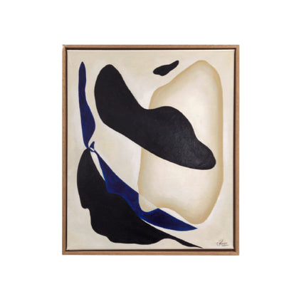
Cream Painting adds calm and sophistication to any space. This collection includes artworks that highlight the beauty of cream paint across various styles and mediums. When applied to a canvas, cream paint brings warmth that resonates with artists and interior designers. These pieces represent different periods and regions, showing how the cream color palette creates a balance of light and shadow. Each artwork captures the appeal of cream wall paint, enhancing any design aesthetic.
Cream painting
Show Filter
The craft of cream painting: philosophy behind our collection
Explore our offerings and see how the wall painting design can enhance your space.
Each cream painting is selected for its aesthetic and the emotions it can evoke. The tones of cream create a welcoming environment. By emphasizing shades like benjamin moore beige, we aim to create a relationship between the artwork and its surroundings.
Art should engage viewers. This collection allows you to connect with each painting and consider how these cream tones fit into your spaces. Each piece represents your aesthetic journey. Let the charm of cream colors inspire you.
Benjamin Moore Beige is a versatile choice in interior design, offering warmth and sophistication. This hue complements various color palettes, making it a preferred option for designers and homeowners. Commonly used in living rooms and kitchens, this shade creates a welcoming atmosphere that enhances natural light. The richness of Benjamin Moore Beige elevates spaces, allowing decor elements to stand out. Its adaptability suits rustic, modern, or traditional styles.
Beige tones are valued for their neutrality. The evolution of colors like Benjamin Moore Beige reflects a trend toward creating serene environments. This shade offers a calming backdrop and connects with cultural influences that appreciate simplicity. Throughout various design movements, from mid-century modern to contemporary styles, Benjamin Moore Beige has remained a reliable choice.
Cream colors bring warmth and tranquility, making them popular in interior design. These shades blend seamlessly with various palettes. When paired with rich jewel tones or earthy shades like benjamin moore beige, cream colors create a balanced look. This versatility makes cream colors a preferred option for many decorators and homeowners.
Using cream colors in your decor adds depth and texture. Consider incorporating materials like plush fabrics, smooth ceramics, or rustic wood finishes to complement your cream tones. Accessories such as throw pillows, rugs, and artwork can highlight the softness of cream colors. Lighting is also important; warm light bulbs enhance the creamy undertones.
Maintaining surfaces painted in cream colors is essential. Regular dusting and gentle cleaning with a damp cloth can help preserve the beauty of walls and furniture. Choose finishes that are easy to clean, particularly in high-traffic areas. For touch-ups, having a small supply of matching paint can help address any scuffs or marks.
Frequently Asked Questions
Cream in paintings often evokes warmth and tranquility, serving as a versatile backdrop or focal point. Historically, cream shades have been used to soften compositions and enhance other colors, creating a sense of balance. In art movements like Impressionism, cream tones were favored for their ability to capture light and atmosphere.
Incorporating cream paintings into decor can enhance the overall atmosphere of a room. Use them alongside earthy tones or muted colors to highlight their subtlety. They work well in various settings, from contemporary to traditional, and can be paired with natural materials like wood and textiles.
Several artists have utilized cream tones in their work. Notable figures include Claude Monet, whose Impressionist landscapes often feature creamy hues, and Pierre-Auguste Renoir, known for his warm color palettes. Contemporary artists also explore cream in innovative ways, blending it with modern materials and techniques.